2012

BHETA
ADVERTISING CAMPAIGN
19 December 2012
British Home Enhancement Trade Association constantly need to attract and retain association members. The campaign which I've created highlights some of what BHETA can offer to it's members, such as a 20 minute 'Meet the Buyers' slot and the opening of doors to the export market.

Stamp Associates
WEBSITE DESIGN
19 December 2012
Stamp Associates is a small firm which offers a full quantity surveying service and offers capital allowance advice for commercial properties. They desperatly needed a website so they could explain the services which they offer, showcase their projects and keep their clients up to date with the latest news. The website is set to go live in the new year.
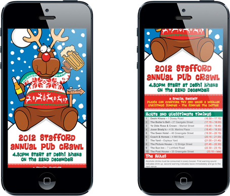
Christmas Pub Crawl
MOBILE OPTIMISED WEBSITE
19 December 2012
The Christmas Pub Crawl route optimised for a mobile device. I've chosen to deliver the all important route online for obvious reasons - cost and ease of use. See you all at the first bar and Merry Christmas. See more

Bord na Mona
ADVERTISEMENT
10 September 2012
Bord na Mona wanted to advertise to retailers their winter convenience fuels range. This advert will run in selected trade journals aimed at buyers in the lead up to winter.
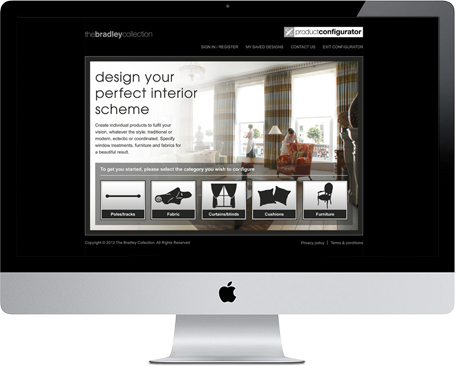
The Bradley Collection
WEBSITE
31 August 2012
The Bradley Collection would like to allow it's customers the opportunity to configure a product they wish to buy prior to purchase. For this brief I have chosen to design a really simple yet stylish product configurator, which can be used by professional interior designers and the general public. The design template can be easily utilised for each product category such as poles/tracks and furniture.

Stewart Garden
WINTER PRODUCT BRANDING
25 July 2012
UK manufacturer Stewart Plastics is branching out into winter products which include fun items, such as sledges, and more practical items like snow shovels. I created these simple logos to help define the two winter product categories on both POS and labels.
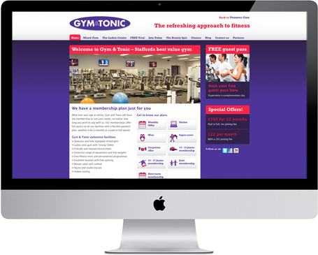
Gym & Tonic
WEBSITE
23 July 2012
Gym & Tonic wanted to update its existing website, focusing on its classes page, as well as revising the layout of the Join Now page. My solution for the Join Now page was to develop individual icons in order to represent each membership plan, combined with columns, which focus upon the benefits of each separate plan.
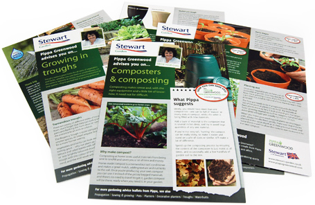
Stewart Garden
LEAFLETS
17 July 2012
This year Stewart Garden teamed up with celebrity gardening presenter Pippa Greenwood. Pippa provided tips and advice for the garden, whilst promoting Stewart products. I've designed this set of eight leaflets ranging from composting to propagation. These can be picked up at your local garden centres for free.

Stewart Garden
GARDEN TIDY BRANDING
31 May 2012
Stewart Garden want to expand their product range into brushware. I designed this new range's brand identity - titled 'Garden Tidy', and here's the logo. I'm currently artworking product labels and POS. This new range is due to lauch this summer.
Living Scheme
ECOMMERCE WEBSITE
17 May 2012
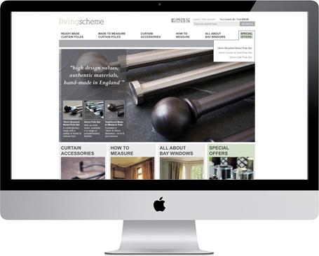
Living Scheme want to have the ability to sell direct to the consumer via an ecommerce website. Initially the site is launching with a small amount of products, with the hope to expand their home furnishings ranges in the future. Here's a glimpse of what will be launched this year.

Axminster Carpets
E-FLYER
16 May 2012
Axminster Carpets wanted to celebrate the Queens Diamond Jubilee with a 20% discount on all of its genuine woven Axminster carpets. To promote this I have designed an e-flyer for them which will be distributed shortly to all of their data captured customers. To support this offer, all retailers have been provided with shelf wobblers and POS.

Gym & Tonic
Advertising
24 February 2012
Gym & Tonic wanted to advertise their new leap year membership offers. The offers give the opportunity for new members to have a professionally photographed portrait taken if they join between 23rd - 4th March. Plus if you are born on the 29th Feb, you get the same offer half price. Due to go to print in all local newspapers this week.

BHETA
Brochure design
14 February 2012
BHETA required a new membership guide as the previous was out of date. The new brochure is smaller in size and weight, therefore cheaper to mail out. I designed it to work alongside the website, focussing on the benefits and ways to join BHETA.
Richard Stonier Photography
WEBSITE DESIGN
07 February 2012
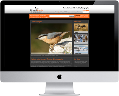
Richard Stonier – a keen birdwatcher and wildlife photographer wanted his current website re-skinning. I decided to keep his existing colour scheme, but felt he would benefit from a new logo and brand identity. Here is the first visual for the homepage – site is due to go live this March.
Our Wedding
WEDDING STATIONERY
13 January 2012
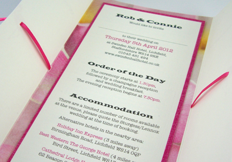
Over Christmas I gave myself a small break, then after Boxing Day I was straight back into design mode – designing our wedding invitations. Our wedding theme is based on our holiday to Kenya where I proposed to Connie. In Kenya we saw lots of frangipani flowers and flamingos which gave us the colour theme to our wedding.

