2011
Stewart
PACKAGING DESIGN
13 December 2011
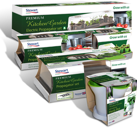
My newly designed packaging for Stewart has hit the shelves. Most garden retailers will be stocking the new 'Grow with us' range. This is a sample of the Kitchen Garden sub range. The brief was to rebrand their existing packaging and incorporate some new products too. See more
Gym & Tonic
WEBSITE DESIGN
29 November 2011
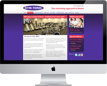
Gym & Tonic recently acquired an out of business gym in Uttoxeter, and wanted a new website which combined Stafford and Uttoxeter gyms. The site had to be fully content managed so the client can quickly update with new offers and keep a blog. Further development to this site will happen in the new year.
RJS Design is not responsible for the ongoing content or modifications to this site.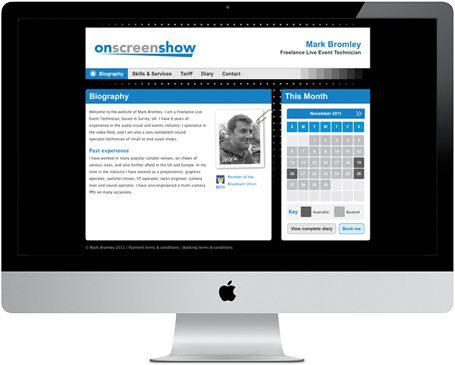
Onscreenshow
WEBSITE DESIGN
09 October 2011
Mark Bromley – a freelance live event technician required a brand identity for his company Onscreenshow and a website. His website most importantly had to display his ever-changing diary. My design solution allows Mark to update his diary where ever he is, so potential clients will know if he's available. Good luck Mark with your new venture.
Stewart Garden
LOGO DESIGN
10 August 2011
Stewart Garden is an established UK manufacturer of plastic products for the garden. They want to rebrand with an emphasis on the fact that they are a UK manufacturer as this is important to them and their consumers. My corporate identity solutions will be used throughout their 'Grow with us' range, which is due to be relaunched this autumn. Here's a logo for starters. See more
Gym & Tonic
ADVERTISING
22 June 2011
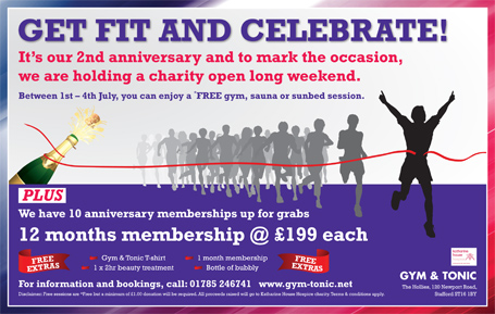
Gym & Tonic want to advertise their 2nd anniversary in the local newspaper. To commemorate the occasion, they are holding a charity open long weekend and have ten anniversary membership up for grabs.

Lo-Cal Tasty
LOGO DESIGN
01 June 2011
Lo-cal Tasty is the name for a new type of cafe experience which prides itself in selling only healthy, tasty food. The client requested that I produce a logo which encompasses this ethos. This design has been used on the cafe signage and website.
Gym & Tonic
ADVERTISING
26 April 2011
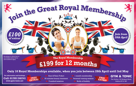
Gym & Tonic want to feature an advert in the local newspaper's Royal Wedding supplement. A Royal Gym Membership has been developed for the occasion which will be sold over the forthcoming weekend and for a limited period after.
Miedema
Website DESIGN
18 April 2011
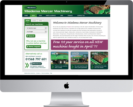
Miedema Mercer Machinery are the only UK based dealership, so having a strong web presence is imperative in their operations. Brief is to design and develop a new website which advertises all their new and used machines. This is a first stage visual which is loved by the client.

Maphouse
LOGO DESIGN
30 March 2011
Maphouse is a company which sells antique maps and prints. They require a rebrand and a new e-commerce website. Inspiration for the logo has come from old compasses and navigational charts. E-commerce website is nearing completion and should go live very soon.

Axminster
ONLINE CARPET DESIGN FACILITY
25 March 2011
This project is very close to going live and feedback from the client is overwhelming praise. In a nut shell the facility allows the user to design their own carpet and view it in a room setting. It's great for visualising a carpet design before you buy it. Its intended use is for the commercial sector, however plans are already being made to roll it out to the domestic sector too. See more
Stewart
PRODUCT PACKAGING
16 January 2011
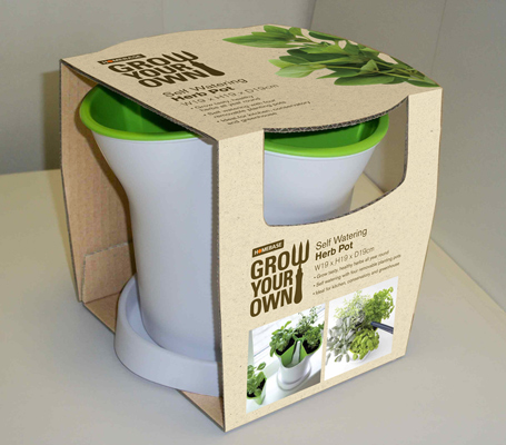
This project is my first proper taste of product packaging design for a new client called Stewart. The brief is to design packaging for a self watering herb pot adhering to Homebase corporate guidelines. See more

